
An insider’s guide to creating effective signage that will attract customers to your door
As someone who has been working in signage and visual communication for nearly two decades, I’ve learned a lot about the incredible variety of signage and how they can succeed — or fail — in representing your business. You may not realize it, but when you find yourself drawn in by a truly effective sign, it is often a highly calculated moment. Each aspect of the sign is guided by a series of questions: What is the best placement? What are the right colors? What does it say? What is the action that should follow?
From the “OPEN” sign in your window to the primary exterior sign (or signs) proclaiming your presence to the world – your street-facing signage is a determining factor as to whether someone keeps walking or feels compelled to walk through the door.
So, how do you decide what sign is the best option for you?
Using my experience, I’ve put together a few helpful guidelines that will help you find the sign that will be most successful for your needs. After all, a good sign could be the difference between bringing in more customers, or not!
Use exterior signage to show your company personality.
It’s important to remember that first and foremost, your sign is a reflection of who you are. It’s not just slapping your name on the side of a building. Every aspect of the sign — the words, the design, the material, the color — these are all elements that give people a glimpse at who you are as a company before they ever step inside. As you weigh your sign options, be sure to consider the first impression your sign will make.
As you weigh your sign options, be sure to consider the first impression your sign will make.
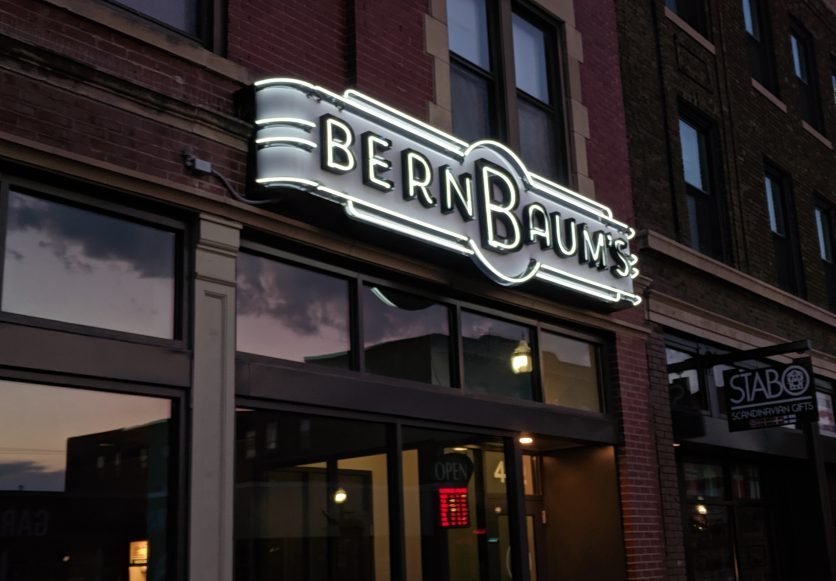
A good example of this is my recent project with BernBaum’s. There are 100 ways to make a sign that says BernBaum’s. You could use budget channel letters or a digital display, from the most inexpensive to the most flashy sign. However, in working with the owners at BernBaum’s Delicatessen, we knew options such as those really wouldn’t speak to what makes this restaurant such a unique addition to Fargo North Dakota’s downtown. Instead, we opted for something that communicates that New York deli vibe that characterizes their brand and the menu. Using classic delicatessen signage as inspiration, the end result brings a historical element to the sign and to the personality of the storefront.
When someone is driving by and they see the sign, they see much more than the name of the business. They get a small glimpse of what BernBaum’s is all about. In this way, when planning for your own exterior signage, consider how your sign can showcase your company personality.
When it comes to words, less is more.
When it comes to the actual words of your signage, less is more. It’s the “picture is worth 1,000 words” mindset. It’s what’s between the lines that speak volumes.
Let’s consider the classic neon open sign we’d mentioned before. This is a sign with clear intent: straight-to-the-point information that’s very easily seen. It serves one purpose, to inform customers whether you are open for business or not and it does so in a way that doesn’t make them need to think about it. Sure, would-be patrons might also be interested in knowing the exact hours your business is open, but that would be too much information for them to take in while driving by. Including it would ultimately reduce the effectiveness of this essential sign.
Now just because the sign’s message is simple, that doesn’t mean that you can’t have a little fun with it. Window signage, done right, is an invitation to the viewer to look just a little deeper and get a sneak peek of what is happening inside. Adding a bit of character to an open sign is a great way to stand out.
Understand your audience.
Understand why the sign exists and who you’re speaking to. If you’re attracting people who are driving by, a projecting sign that is visible to cross-traffic and features what it is you’re selling might be the best choice. For instance, picture all the old classic signs from urban settings. Most of these signs simply say one or two words: Cafe. Coffee. Used Cars. Motel. They don’t get hung up on the name of the business even; the goal is to let the viewer know you can provide something the thing they need at that moment.
However, if your business is more of a destination, you may find more value investing in a sign that is on the face of your storefront. Destination signs feature your name more prominently because customers likely already know your company name and will be looking for it. It’s less of an impulse buy for them. Understanding your customer’s buyer’s journey is a crucial part of choosing the most effective signage for your business.
Have a concept of what you’re looking for before you start the project.
You’ve decided to get some snazzy new exterior signage — congrats! Before you approach a vendor, take some time to walk through to develop an idea of what you’re looking for (this guide will help). Do your best to come up with some concept of what you’re looking for, and what you’d like the sign to accomplish. This will provide a helpful starting point for you and your sign vendor to work together to create the perfect sign for you.
However — try not to be so in love with your concept that you are not open to the vendor’s feedback. Starting the conversation with an idea is essential, but getting too hung up on that idea could lead to missing out on benefiting from your vendor’s experience. This can ultimately be a missed opportunity for turning a good sign into a great one. If a vendor takes your idea and does not have any input, they likely don’t care. I know from experience that it would often be easier to do exactly what customers asked for — but that would be doing a disservice to them. A good vendor partner will take your idea and provide helpful feedback, working with you to create the most optimal signage for your needs.
Allow yourself to be flexible with your logo design.
On that note, keep in mind that your official design or logo may not always translate well into signage. Oftentimes, logo designs are made for print media and do not make sense as a sign for any number of reasons. The right vendor will help guide you on ways to adapt your logo, when necessary while staying true to your brand.
Above all else, don’t be afraid to stand out.
It should go without saying that being able to stand out among the crowd is a good trait in business, and the same concept applies to signage. Still, it’s amazing how few people (or vendors) think to consider the vast array of wonderful materials and methods we have to choose from these days.
For example, industrial materials such as carved wood, raw iron, and natural stone, when used for signage, can lend an air of authenticity and permanence to the businesses they represent that the imitations can’t hold a candle to.
For me, when deciding to start my own sign company, I chose to focus almost exclusively on crafting authentic neon signage using classic sign fabrication techniques. I’ve found providing this increasingly niche sign medium to be a great method that compliments the unique services my preferred clients have to offer.
It’s absolutely not a great fit for just any business, but I suppose that’s kind of the point.
-Chris Orth
Fireline Neon Company President